Overview
Design Solution Highlights
User Research
Solution
UI Design Screens
Reflections

Storeplus
About the Project
Storeplus is a management system which connects wholesalers and retailers. It provides a centralized platform for collaboration and management
Company
Almach Labs
Role
Solo UI/UX Designer
Team: 1 Designer, 1 Product Manager
and 2 Software Engineers
Team: 1 Designer, 1 Product Manager
and 2 Software Engineers
Timeline
8 weeks
Tools
Figma
Read Time
8 mins
Overview
Methodologies used: User Interviews, Secondary Research, Affinity Map, Competitor Analysis, Stakeholder Map, Value Proposition Mapping, User Persona, Brainstorming, Information Architecture, Wireframe, Visual Design System, UI Designs, Prototyping, Usability Study
More about the project
StorePlus is a smart management system developed for the company Almach Labs to streamline operations between wholesalers and retailers. It brings everything—inventory tracking, order management, and communication—into one simple platform.
Like our stakeholders say,
"With StorePlus, businesses can stay organized, avoid delays, and work together more smoothly"
Like our stakeholders say,
"With StorePlus, businesses can stay organized, avoid delays, and work together more smoothly"
My Contribution
As the only UI/UX designer on the project, I designed a platform that made inventory management smoother and daily operations faster—boosting efficiency by 24%. I led the entire design process, from research and wireframes to high-fidelity prototypes and responsive layouts. Working closely with the team and stakeholders, I ensured the final design was both user-friendly and ready for development.
The Challenge: A Broken System
“ How might we design a platform that enhances communication, improves inventory visibility, and streamlines order management to optimize collaboration and efficiency for wholesalers and retailers?
Wholesalers and retailers face multiple challenges in the existing supply chain process, including poor communication, lack of real-time inventory tracking, and inefficient order management. These issues cause delays, errors, and a lack of transparency, disrupting operations and reducing customer satisfaction.
The Game Changing Solution
StorePlus eliminates chaos
With real-time inventory tracking, instant order updates, and seamless communication, wholesalers and retailers stay in sync effortlessly. No more guesswork, no more delays—just a smooth, efficient system that keeps businesses running and both parties happy.
With real-time inventory tracking, instant order updates, and seamless communication, wholesalers and retailers stay in sync effortlessly. No more guesswork, no more delays—just a smooth, efficient system that keeps businesses running and both parties happy.
Design Solution Highlights: Turning Insights into Action
Problem 1: Order Status is unclear and lacks visibility

.png)
Problem 2: Adding items to inventory is overly complex and requires too many steps
.png)
Problem 3: No quick-access inventory stats for a clear overview
.png)
The Impact: From Chaos to Clarity
Since adoption, the system has facilitated over 10,000 transactions between wholesalers and retailers, improving overall user satisfaction scores by 75%.

20%
boost in sales for partnered retailers
25%
increase in inventory accuracy

40%
reduction in order errors
30%
reduction in order processing times
The Roadblocks We Had to Overcome
Key User Pain Points

Finding 1
Fragmented Data Management & Lack of Real-Time Tracking

Finding 2
Inefficient Communication & Order Management

Finding 3
Complex & Tedious Inventory Processes
Deeper Analysis of the Problems they faced


But, How did we get here?
Listening to the Real Experts: User Research
To truly understand the challenges wholesalers and retailers face, we went straight to the source.
Through user interviews, field studies, and think-aloud sessions, we uncovered real frustrations and workflow inefficiencies. Watching users navigate their daily tasks in real time gave us valuable insights into what slowed them down and what they needed most. These hands-on research methods helped us design a solution that fits seamlessly into their workflow, making their jobs easier and more efficient.
Through user interviews, field studies, and think-aloud sessions, we uncovered real frustrations and workflow inefficiencies. Watching users navigate their daily tasks in real time gave us valuable insights into what slowed them down and what they needed most. These hands-on research methods helped us design a solution that fits seamlessly into their workflow, making their jobs easier and more efficient.
.svg)
10+ Usability Tests & Think-Aloud Sessions to refine the platform’s usability, leading to a streamlined ordering process that reduced modification errors.

12+ User Interviews to uncover pain points in inventory management and order tracking, revealing that miscommunication was a major bottleneck.

Field Studies to observe wholesalers and retailers in action, showing that manual inventory updates were time-consuming and error-prone.
What Works, What Doesn’t: A Competitive Breakdown
I analyzed five key competitors to understand the competitive landscape and identify strategic advantages for the solution. Two of these applications were previously used by our client which helped us gain first hand insight of the problems faced.
Outcome: The analysis revealed gaps in features like online consultations, offline support, and community engagement. This helped in identifying opportunities to differentiate our product with unique features tailored to user needs.
Outcome: The analysis revealed gaps in features like online consultations, offline support, and community engagement. This helped in identifying opportunities to differentiate our product with unique features tailored to user needs.

Stakeholder Map
As there were too many stakeholders at multiple points of the project, it was important to create a stakeholder map to represent the relationships between different stakeholders involved in the system.
Outcome: This mapping clarified the lines of communication and influence, allowing us to prioritize user needs based on their roles and impact within the organization.
Outcome: This mapping clarified the lines of communication and influence, allowing us to prioritize user needs based on their roles and impact within the organization.

Value Proposition Mapping
To streamline the data and set expectations from the clients' end it was deemed important to define the unique value our solution would bring to both wholesalers and retailers, aligning it with their core needs.
Outcome: This exercise pinpointed specific benefits such as reduced processing time, increased accuracy in order fulfillment, and enhanced user satisfaction through an intuitive interface.
Outcome: This exercise pinpointed specific benefits such as reduced processing time, increased accuracy in order fulfillment, and enhanced user satisfaction through an intuitive interface.


Illuminating Insights
Designing StorePlus was not just about creating an intuitive interface—it was about solving real problems
To ensure the platform was truly user-centric, I incorporated competitive analysis, user persona, journey mapping and iterative prototyping. These methods helped me uncover pain points, streamline workflows, and refine the design through continuous feedback.
How these processes helped me shape my decisions
Competitive Analysis
- Spotted major pain points in competitor platforms—lack of real-time stock updates, cumbersome inventory workflows, and no offline support
- Designed instant stock tracking, bulk inventory actions, and offline accessibility, making StorePlus a smarter alternative

User Personas
- Built personas for retailers needing quick order placement and wholesalers managing bulk inventory
- Created custom dashboards, AI-powered stock alerts, and in-app messaging, catering to their exact workflows

Journey Mapping & Task Flows
- Mapped out real-life struggles of retailers and wholesalers, uncovering bottlenecks in order placement and inventory tracking
- Reduced unnecessary steps, optimized navigation, and cut down task completion time by 24%

Iterative Prototyping
- Early users struggled with confusing CTAs and cluttered screens—quick iterations improved clarity and usability
- Refined UI through multiple feedback cycles, ensuring every interaction felt intuitive and frictionless
From Ideas to Innovation: Features


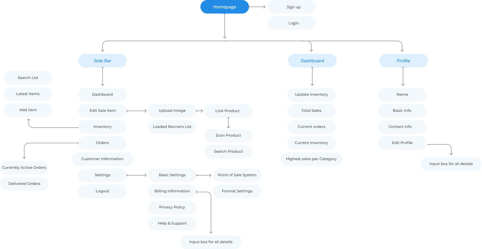
Information Architecture
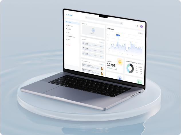
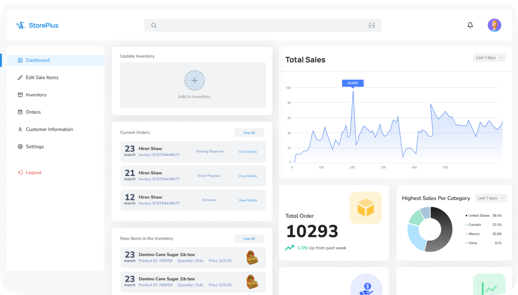
Bringing the Vision to Life: UI Design Screens
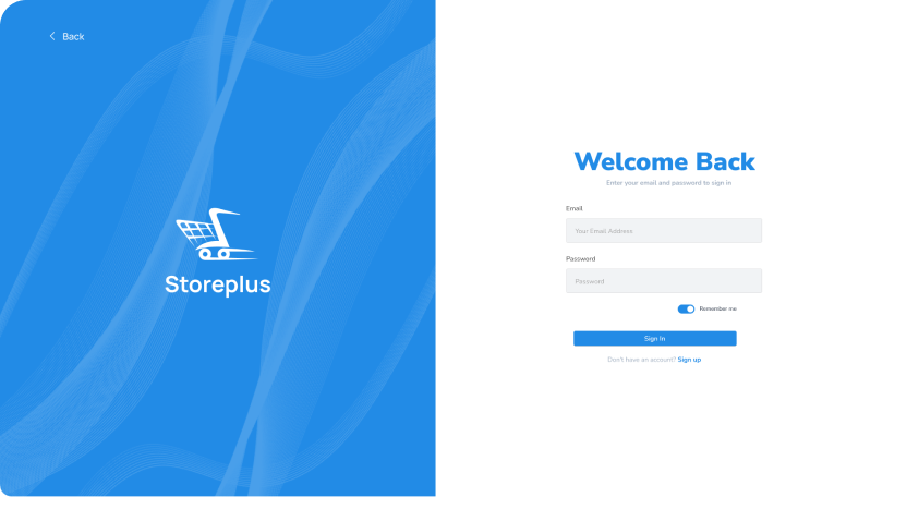
Home Screen + Log In Screen


Overall Inventory + Active and Delivered Orders


Add Item to Inventory + Order History
User Test Summary
01
Provide Contextual Help
Offer contextual help and tooltips throughout the dashboard to assist users in understanding features, functions, and terminology.
02
Interactive Data Visualizations
Allow users to drill down into data, filter results, and customize visualizations to gain deeper insights into their business metrics
03
Performance Optimization
Improve the performance and responsiveness of the dashboard system to reduce loading times and latency
04
Accessibility Enhancements
Implement keyboard shortcuts, screen reader compatibility, and color contrast adjustments to accommodate users with disabilities.
05
Error Handling and Feedback
Implement validation checks, error prevention techniques, and feedback loops to help users resolve issues effectively.
Lessons, Growth, and What’s Next


