Overview
Research Goals & Plan
User Interviews
Affinity Diagram
Coding Tree
Think Aloud
Performance Based Metrics
SUS Scale
Findings & Reflection
UX Research Case Study
Assessing and Analyzing the Notion App Experience
This project aims to evaluate the usability of the Notion app among new users, focusing on identifying pain points and overall satisfaction with the interface.
Notion App

Overview
Team Members
Amy , Lizeth, Sreesha
Role
UX Researcher
Methods Used
Think Aloud, User Interviews, Affinity Diagram, User Personas, Performance and Issue Based Metrics, System Usability Scale
Timeline
4 Weeks
What is Notion?
Notion is a single space where you can think, write, and plan.
Notion provides a single space for organizing everything from lead data to to-do lists to company wikis, allowing you to turn it into a CRM, a project management tool, and with the help of Notion AI, a writing partner.
Understanding Notion Better
Take Notes
Track Your Goals
Create To-do Lists
Study with Notion
Create a Wiki
Build a Custom CRM
Design a Live Webpage
Manage Your Content Calendar
Collaborate on Projects
Organize Data, Plan ahead
Motivation
Scope of improving the user experience
Improving User Engagement
Notion has a large user base which would help us gain more insights and identify pain points which are affecting a huge user base
Refining the experience for new users
Notion has a lot of features, hence, it can become overwhelming for the first-time users.
Enhancing the features for existing users
Existing users can guide us to understand the efficiency of the features and improve upon them
In recent years, students have more options for taking notes, including tools like mind mapping software, digital whiteboards, and apps for handwriting on tablets. Notion stands out because it is more than a typical note-taking app. It lets users organize and manage information easily with databases and well organized features, making it useful for both schoolwork and project management.
Our motivation behind researching notion was to explore unique ways the complex yet extremely intricate application poses any challenges or expectations when using it for academic tasks.
Our motivation behind researching notion was to explore unique ways the complex yet extremely intricate application poses any challenges or expectations when using it for academic tasks.
Fun Fact! Notion has passed over 100M users, with over 30 million monthly active users
Goals of the User Evaluation
The goal of this research is to gain insight into how students take notes, what they expect from a tool like Notion, and the specific situations in which they rely on it for their studies. The findings will help provide useful recommendations to improve Notion's features for students, making it an even better tool for academic work.
Research Goals
01
To understand how college students use Notion to help with classes
02
To identify potential barriers and motivators for note-taking
My Role
What was my contribution in the research?
User Interviews
Affinity Diagramming
Persona Development
Think Aloud Method
Performance Based Issues
Data Analysis
System Usability Scale
Research Plan
Participants
A total of 6 participants completed the think-aloud protocol, all of whom were new users of the Notion app. The demographic details of the participants are as follows:
Age Range: 18-27 years
Gender: 3 females, 3 males
Education Level: Graduate School Students
Technical Background: 3 from Engineering and Computer Science Background, 3 from Human-Computer Interaction Background
Age Range: 18-27 years
Gender: 3 females, 3 males
Education Level: Graduate School Students
Technical Background: 3 from Engineering and Computer Science Background, 3 from Human-Computer Interaction Background
Recruitment
To recruit the participants for the study, we targeted new users to receive a fresh perspective and insights. The recruitment was conducted through student forums and university channels. The demographic requirements included equal representation by gender, age range, and educational background.
Interested individuals completed a screening survey to confirm their eligibility based on experience with Notion and their educational background.
Interested individuals completed a screening survey to confirm their eligibility based on experience with Notion and their educational background.
Procedures
The research involved a mixed-method approach an it is structured into the following steps:
1. Think- Aloud Protocol
2. User Interviews
3. Affinity Diagramming
4. User Personas
5. Performance and Issue-Based Metrics
6. System Usability Scale (SUS)
1. Think- Aloud Protocol
2. User Interviews
3. Affinity Diagramming
4. User Personas
5. Performance and Issue-Based Metrics
6. System Usability Scale (SUS)
Data Analysis
The data collected throughout the research project was analyzed using the following methods:
1. Qualitative Analysis of Think-Aloud and User Interview Data
2. Affinity Diagram Analysis
3. Performance and Issue-Based Metrics Evaluation
4. System Usability Scale (SUS) Scoring
5. Synthesis of Findings
1. Qualitative Analysis of Think-Aloud and User Interview Data
2. Affinity Diagram Analysis
3. Performance and Issue-Based Metrics Evaluation
4. System Usability Scale (SUS) Scoring
5. Synthesis of Findings
Tools and Methods Used
User Interviews
Understanding the users better
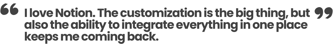
I interviewed 2 users to understand more about the challenges users faced while using Notion. User Interviews help explain, better understand, and explore users’ opinions, behavior and experiences. We employed a structured interview approach, covering various aspects of this journey, where we categorized the questions into several key areas: General Experience, Overall Satisfaction, Performance, Navigation/Usability, Customization, Team Collaboration, Features Improvement, and one open-ended question.
This approach helped us gain insights into the user journey, from discovering the tool to specific challenges and benefits experienced.
This approach helped us gain insights into the user journey, from discovering the tool to specific challenges and benefits experienced.


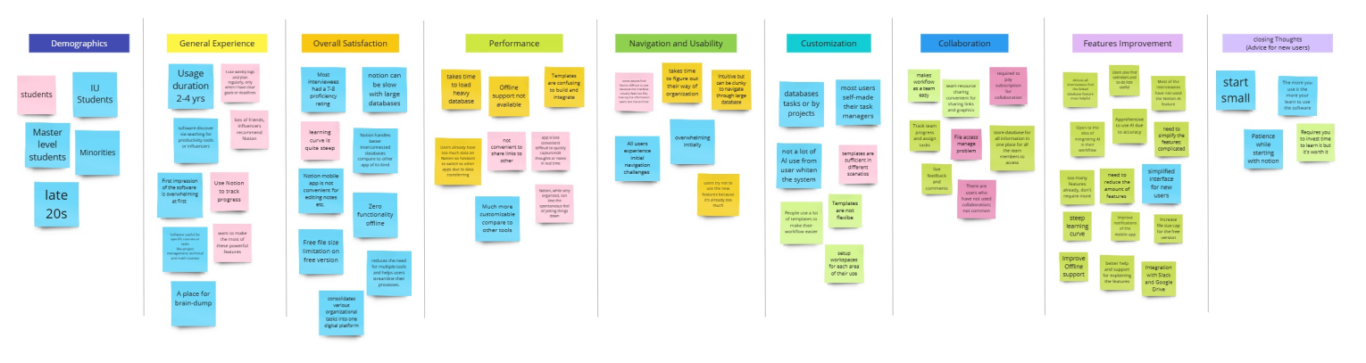
Affinity Diagram
Clustering of Valuable Insights
The analysis process involved creating an affinity diagram to visually organize the data received from the user interviews. After transcribing the interviews and compiling our notes, we identified common themes and categorized the insights to these themes such as, general experience, overall satisfaction, performance, navigation and usability, customization, collaboration, features improvement and closing thoughts
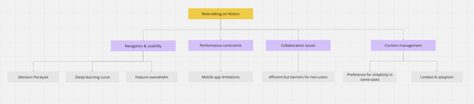
Coding Tree
Creating a Thematic Structure
We used a Coding Tree to organize and analyze qualitative data gathered from our study. By breaking down participant responses into hierarchical themes and sub-themes it allowed for us to identify patterns and reveal insights
User Persona
Crafting our Ideal Target User
The think-aloud task provided valuable insights into user interactions of the app. It helped us identify which areas do users struggle navigating or find overwhelming. It also helped us observe the number of clicks a user requires or even the time the user requires for a simple task.

Think Aloud
Gaining insights using a user walkthrough
After gathering all the insights we created a user persona to help designers and researchers understand and empathize with the target audience. This would help guide product decisions that would align with users’ expectations
Problem 1:
Main Task: Create a page and make a list of 3 to-do’s and check them
Goal: Understand the navigation challenges faced by new Notion users when performing the most essential tasks: creating a page, making a to-do list, and checking them off
Goal: Understand the navigation challenges faced by new Notion users when performing the most essential tasks: creating a page, making a to-do list, and checking them off
Problem 2:
Main Task: Add a Template to your Workspace
Goal: Understand new Notion users' expectations and needs for the template feature when they want to start creating their own workspace, as well as the navigation challenges they face
Goal: Understand new Notion users' expectations and needs for the template feature when they want to start creating their own workspace, as well as the navigation challenges they face

Following the think-aloud session, the insights were gathered into an excel sheet and then the patterns were identified and noted in Miro Board. insights were organized in an Excel sheet to categorize key findings. Usability issues were then analyzed for patterns and recurring challenges to identify the usability concerns and areas of refinement.

Performance and Issue Based Metrics
Probability of Detecting Issues
After consolidating all user-reported issues and combining recurring ones, a chart was created based on ratings from six evaluators

Data Analysis
System Usability Scale (SUS)
A System Usability Scale (SUS) questionnaire was asked to fill by the participants after the think aloud session. This data was then integrated into an excel spreadsheet and the SUS scores were calculated by adjusting the raw ratings, and then multiplying by 2.5 to obtain the final score

Interpretation from the SUS Score
After calculating the final SUS Score from all the group members, the average SUS score for the product was 75 for Task 1 and 80 for Task 2 which is significantly higher than the industry standard of 67 for good usability. This suggests that the product is generally perceived as easy to use and effective in meeting users' needs. Later the 95% Confidence Interval (CI) for the mean SUS score was calculated followed by margin of error and confidence interval. As the true mean usability score lies within this range. This indicates the system may have very few usability issues
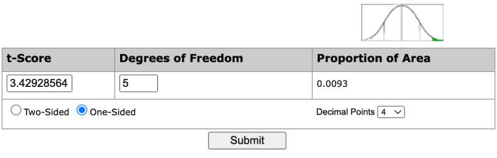
T Score
Task 1
Task 2
T-Distribution
Using the calculator, we get the probability as 3.42928564 for Task 1 and 5.87877538 for Task 2. This means we can be confident that Notion has an average score higher than the industry standard of 67
Task Success Criteria and Analysis
Task 1: 4 out of 6 users (66.7%) completed successfully
95% Confidence Intervals: 29.56% - 90.75%
95% Confidence Intervals: 29.56% - 90.75%

Task 2: 5 out of 6 users (83.3%) completed successfully
95% Confidence Intervals: 41.76% - 98.87%
95% Confidence Intervals: 41.76% - 98.87%

Key Findings
Task 1: Task Creation & Usability
01
Unfamiliar Navigation Compared to Other Apps
02
Extra To-Do Items Generated Automatically
03
Inability to Quickly Add New To-Do Items
04
Difficulty Finding the To-Do List Feature
05
Unfamiliar Content Creation Methods
Task 2: Template Navigation & Integration
01
Difficulty Navigating to the Template Section
02
Overwhelmed by Too Many Options in the Template Page
03
Confusion About Template Placement
04
Lack of Clarity in Adding Templates to Workspace
Design Recommendations
Based on the critical issues identified we propose the following improvements to enhance the user experience in both Template Navigation & Integration and Task Creation & Usability in the Notion Web Application:
Task 1: Task Creation & Usability
- Allow Easier Addition of New To-Do Items
- Provide a More Familiar Navigation Experience
- Simplify Content Creation Steps
- Eliminate Automatic Extra To-Do Items
- Streamline To-Do List Creation
Task 2: Template Navigation & Integration
- Improve Template Access and Discovery
- Reduce Cognitive Load by Organizing Templates
- Clarify Template Application Process
- Simplify Template Addition
Reflection
This design challenge allowed us to think more deeply about how users think and navigate through a complex application and how it can be made better
Throughout our design process, we learned two key things:
- The combination of qualitative and quantitative methods provided a well-rounded view of the user experience. While the think-aloud and interviews offered deep insights into user perceptions and frustrations, the System Usability Scale (SUS) added an objective benchmark to measure overall satisfaction. This multi-method approach validated our findings and helped ensure that our recommendations were both user-centered and data-driven.
- Working with participants from diverse technical backgrounds, including both engineering and human-computer interaction fields, underscored how different users approach the same interface in unique ways. This diversity highlighted the importance of creating flexible, intuitive designs that cater to a wide range of user expertise.


